
It's Time to Come Together
In this cautious time of working remotely, temporary shutdowns, and social distancing, it’s important to remember to be calm, creative, and to think of ways to still connect.
Everyone, especially small businesses, is facing lots of challenges right now. A goal as a business owner is to guide your company through this period in the best way possible. It’s time to think about your business in a new and unique way and take this time to prepare for what may come next. How every market reacts within this global crisis for the next few weeks will determine how quickly we all can resume normal operations and be as successful as before. How can you impact your actions going forward? Just remember, you don’t have to act right now. There will come a time when the public is ready for it. Here are a few steps you can take today.
Step 1. Adapt Your Business If You Can
It is understood that not every small business can adapt in a short timeframe. Simply focus on the adjustments you can make. This is a time when your outreach and connection matters. Offer to help in different ways if sales become a challenge. Most of all, even a small change can make a difference, so don’t be afraid to be creative. Adapt your services to the needs of your client. I am noticing that a lot of the local gyms are now offering online workouts as well as using daily emails to send out exercises you can do at home. Restaurants are offering delivery or curbside pick-up. Now is not the time to make a great sales pitch to buy, buy, buy, but it’s a time to find simple ways to keep your business going and come from a place of giving and gratitude.
Step 2. Deepen Existing Relationships
Now that we are all forced to take it a bit easy, it’s the time to reach out and connect with those that you haven’t spoken to in a while. Take care of those you are close with and remind them that we are all in this together. Even with the ability to text and email, picking up the phone just to hear someone else’s voice to see how their experience is going may add a bit of joy to their day, and yours. Email newsletters or blog posts, like this one, will help to communicate what may be happening while working from home. The use of tools as Zoom, Skype, or Google Hangouts are making meetings happen. If you’re planning to continue to use social media, use it to communicate about your daily operations, about the precautions you and your team are taking to assure public safety. Let’s just keep it positive and be good to one another.
Step 3. Prepare Your Online Presence / Website
Now might be an excellent time to take care of the things you have not had time for in the last few years. If your website is more than five years old and you have been considering an update, this would be the time to do it. When the fears pass, you will be ready to enter the market with a valuable asset. If you were considering adding new services, processes, or functionality, this might be the time. What about creating an editorial calendar for your social media or setting up an automated digital campaign, do it now. You will not be able to utilize it immediately and create new prospects within hours, but it’s a long-term investment that can change and improve your business in the future.
Step 4. Pause, Reflect, and Focus on You
Think about ways you can make your business better for the future. Take the online class you have been interested in but never seem to have the time. Read those books or articles that you have bookmarked. Improve a skill you have been dying to improve upon. Think about the strategy for your future email campaigns. Improve your client tracking. Find the practical task that will keep you focused, positive, and looking forward. Don’t let any fear into your business. Stay positive for you, your employees, and your clients.
Step 5. Focus on The Future
A small number of businesses and brands will handle this situation the right way. Become that business. People will remember how you handled your marketing at this time. So instead of pushing your message today, focus on how it looks in the future. When things calm down, make sure you have a good marketing strategy in place. This means planning your kick-off to your email campaign, maybe sending out promotional postcards, and updating your website. If you plan for it right now, you will be ready, and your transition will be a lot easier. Most of all, stay strong and know, we will all get through. And of course, I am here to help if you need it.

Design: A commodity or a critical asset?
Should you go to a freelance crowdsourcing marketplace when looking for a designer?
When you don’t really care, yes, but if you do care, you are taking a risk.
Recently, I was listening to Ilise Benun of Marketing Mentor’s podcast, “What is your value to your dream client.” where she quoted Steven Gates, Head Design Evangelist of InVision. “Design is disrespected and underfunded, it is treated like a commodity rather than a critical asset.”
In the podcast, Ilise encouraged designers to rethink how we see ourselves and how our prospects may see us. I was captivated by the quote and set out to see what others thought. At a recent networking event, I had the perfect opportunity:
I was speaking with a printer that I met at the event. When I told him, “I’m a graphic designer who works with startups and entrepreneurs, providing brand strategy and creatives services,” he expressed that he usually works with crowdsourcing marketplaces for his graphic design needs. Crowdsourcing, according to Merriam-Webster, is the practice of obtaining needed services, ideas, or content by soliciting contributions from a large group of people, especially from an online community rather than from a traditional service provider, i.e., a designer.
I was curious about this printer’s reasons for choosing to crowdsource rather than to partner with an experienced designer. This gentleman stated that his customers want a few options to select from, without spending a lot of money, usually within a tight timeframe—and that with crowdsourcing, he has had great success. It was as if “artwork for a project” was all that was needed in most cases. A simple transaction. He didn’t seem to consider the possible benefits or value of strategic design, but then again, maybe his clients didn’t require the benefits or value either.
Was this printer an ideal client for me? Not necessarily. But his take on design—and its value (or lack thereof)—got me thinking: Are there times when sourcing to a freelance crowdsourcing marketplace is okay? Are there times when it’s never okay? And most of all—how can businesses in need of design find the designer that will best suit their needs?
Is Crowdsourcing Ever Okay—and When?
This may come as a surprise, but I know there will always be a need for those quick, down-and-dirty, cheap projects, where the goal is to have something for that one-time event, like a t-shirt design that will be used for your brother-in-law’s guys fishing day out. In my opinion, crowdsourcing is okay for a project like that, for it is likely, that the very same design will be repurposed for others with a similar request. Since nothing is being branded for mass appeal, bought or sold, or being used to establish a companies graphic standards, there’s no need to build value or loyalty around this “brand”—and that is okay.
However, when it comes to a growing business, it is vital to consider the value, strategy, and overall goals that this project must achieve. In this case, crowdsourcing the design is not a great option, and there are many reasons why.
The Downsides of Crowdsourcing
When taking a chance with crowdsourcing, you may encounter the following:
- Design or artwork that really doesn’t hit the mark of what you may have envisioned or expected
- Artwork that was not correctly created in file formats that will work for all mediums and sizes
- Receiving artwork that was repurposed, or used over and over by others
- The final cost being beyond what was initially expected or quoted
- The time to complete the project is longer than expected
- There is much hand-holding in the execution of the design—you are telling the designer exactly what to do, and there is no collaboration or development for improvement
- Communication mishaps due to email-only exchanges, long response times between rounds, no local access to meet in person, working within different time zones, or simply just not knowing the person you are working with
Price of Crowdsourcing—Deal or No Deal?
Sure, you may get a low price if you crowdsource, but what does your business lose? Several essential questions immediately came to mind about the effectiveness of such a cheap and possibly unreliable resource. I was curious:
- What value is being placed on this project?
- What is the strategy, and how does this project drive success for the company?
- Was there research conducted into the competitors or the target audience?
- What was the process of giving and receiving feedback? Was the process collaborative and responsive?
- How was the feedback incorporated to develop and improve the development of the project?
- How did they know if the item created was unique to them and worked within their overall marketing plan?
- Would the design stand the test of time?
- Did the designer care about your timeframe, budget, or business goals?
It is hard to say if these factors were considered but when you are starting or running a company, these factors need to be top of mind.
I say let’s not forget the adage: You get what you pay for.
The Evolution: When You Need More Than Crowdsourcing
Crowdsourcing might get your company to a certain point. Still, when a crowdsourcing dependent company realizes they need strategy and partnership in order to grow or have just had a horrible experience working with a crowdsourcing designer, they may approach a design partner with skills, talent, and relevant expertise. Which is great!
Unfortunately, since this company has gotten used to crowdsourcing, and treating design as a commodity for the lowest price, they often don’t understand the value of good design or realize what it costs. Value can be hard to understand until you actually experience it.
Often times, these companies come to a crossroads or a breaking point—where crowdsourcing isn’t worth it anymore, and it’s time to move forward. This is where reaching out a design partner to provide all encompassing solutions, is a great idea!
What Qualities Should You Look for in a Professional Design Partner?
If you take your business seriously and want to grow and thrive in the long term, you will benefit from finding a design partner that has the following qualities.
- A strong work ethic—follows or establishes a timeframe and shows initiative to complete the task at hand
- Is responsive and reachable—even if they are in a different time zone, there is a conversation and timeline set up to have those questions answered and those problems solved
- A strong portfolio—showing creative examples of the types of projects you are looking to complete
- Provides recent references—a reliable reference helps solidify the working relationship as well as review the process you will experience
- The focus is on your project and goals—not about their ego
- The designer is easy to work with—shows genuine interest in building the relationship and helping your company grow
- Is honest about what they can and cannot do—a true partner is a designer who is open about their expertise on a particular project type, and if they don’t feel able to do a fantastic job, will refer work to someone better suited
- Displays flexibility and adaptability—knows how to handle and take care of unexpected things that may come up
- Can take the ball and run with it—is collaborative with you as well as other members of your team
- Is respectful of your time—we are all busy, but deadlines are created for a reason!
- Is respectful of the budget—the right design partner communicates openly about the budget and lets you know if any adjustments may arise
- Saves you time—because you are building a relationship, projects/questions/and expectations are discussed and can be handed over so you can do your job and the designer will take care of the rest
- No learning curve—a design partner that you consistently work with will know what to do and take care of it for you
- Anticipates Needs—a design partner will be able to see the overall picture and make recommendations to enhance your project, or will know a direction to take that will get you started
Final Thoughts
Whether you crowdsource your project or partner with an experienced designer, you ultimately decide what is best for you. Still, I can tell you, when you find a great designer to partner with, you will see that they become a part of your team and aid the growth of your company. Trust, comprehension, and value, in addition to expertise, creative skills, and willingness to get the job done, will help your business grow and expand.
Are you ready to find your ideal design partner to help your company grow? I can help you with that. Contact me to get started. You will be glad you did!

Creating Powerful Presentations
At the recent HOW Design Live Conference, held in Chicago, I had the opportunity to attend a talk by Stefan Mumaw on “Presentations That Rock: How To Stand Up There And Slay.” I was in awe of the way Mr. Mumaw described the formula for building a presentation from planning, connection, and visual support through storytelling. He brought up some compelling points of what makes a presentation successful. It suddenly struck me was that I was looking at presentations the wrong way and here is why:
There are two different types of presentations.
- Presentation with speakers who tell stories, captivating audiences with their ideas and passion. The eyes of the audience are glued to the speaker, fascinated with every word. Think great speakers like Steve Jobs, Martin Luther King, Jr, or Sheryl Sandberg. These speakers either don’t use a deck or the deck is constructed with beautiful visuals that are crafted and lovely to look at.
- Presentations that are actually documents, may be a bit more educational and serve a particular purpose for that company or event. The focus is on the content of the deck, and the speaker is less of a focal point. The decks may have a lot of bullets, charts, and graphs that may be hard to read or flash by too quickly. Now, I am not saying that this type couldn’t be captivating or tell a story, but they are handled in different ways. Therefore, the deck needs to be designed differently. In either case, the goal is to communicate an idea or that one single thing, that matters most, to the listener.
So how do I encourage my clients to think more strategically about their PowerPoint or Keynote presentations? I decided to reach out to Mr. Mumaw for his advice.
His response was this: “When starting off, ask if it is a presentation, or is it a document?”
A presentation is more than just someone talking on a stage. It is an opportunity for a speaker to become a storyteller. An excellent presentation has ebb and flow, the element of surprise, passion, the give, and take. Speakers capture the audience with authenticity, passion, emotion, and courage. If a deck is used, it is used as support, not as the guide. Decks don’t move people, people move people. The audience is solely focused on the speaker, and the deck lends itself to support the speakers’ story visually. What is the designer’s role in a presentation? To create the ebb and flow with the use of video and visual backgrounds to support but not take away from the speaker. How do I encourage my clients to rethink their presentations? Mr. Mumaw states, “It is our responsibility as a creative to teach what a presentation is before we even start a design. Come to an agreement or understanding of what makes a great presentation, that people don’t want to read, they want to be moved, and remind the client of what moves them.”
Example of a presentation that might be considered a document but utilizes a visual base.
So how do I approach this thinking with my clients? He continues, “Education is always the most effective way to collaborate, and that’s what a deck design is: a collaboration. As a designer, if you try to educate during the gathering of content, you will always lose those battles, for your client is invested in the content at the point and won’t want to waste time or circle back. But if you educate ahead of time, do your own ‘presentation on presentation,’ show decks that you believe are designed well and presentations that you believe are effective, get everyone to agree, you have a base of standard, and the subjectivity is lessened.” For this type of presentation, ideally, the designer is brought in before any type of deck is constructed so that roles, decisions, and the outcomes are agreed upon in the beginning, not during or when it is too late.
What if it is a document? In reality, most clients ask for a “document.” A team of people work on the gathering of content and data to compile into a deck, then hands it over to a designer to make pretty, seem less crowded, maybe add a few animations, etc. At this point, a “document” is comprised of a deck and a speaker (or many speakers) presenting as the voice over to that content. In this context, the audience is most likely to be less focused on the speaker and pay more attention to the deck.
As a designer, it is my task to take that information then and apply a design that helps assist with that story. How do I design the ebb and flow, add surprises and resolution in the content provided to me and make it visually interesting? That is the challenge. Mr. Mumaw recommends asking these essential questions:
- What is the purpose?
- Who will need to edit?
- How will it be delivered?
- Who is the audience?
- What is the lifespan?
Once you have these answers, as a designer, you should be able to know your limits and set out to design, and design it well.
When thinking about what type of presentation you want to create, know your audience well! “Every industry is different. Every audience in every industry has one thing in common: they’re human. They can, and want to be moved. What moves a group of scientists is different than what moves a group of film students, but both want to be inspired, they want to be informed, and they want to be entertained.”
I was very honored to have Mr. Mumaw’s advice. I genuinely appreciate his viewpoint and hope you do, too. And to quote his sincere sign-off: “No one has ever said, ‘Man, I hope this presentation is information dense, and the presenter reads it.’ At least I haven’t come across someone who has yet”!
So when all is said in done, I hope to be able to incorporate his guidance into my next presentation assignment – maybe for you? If you’re starting to think about your upcoming presentation (or a future project) and want to create a “presentation that rocks,” let’s talk.

Starting a Business? Some Things May Not Be So Obvious
Recently, I have had a rush of new clients come along that need help getting their business started. But what exactly do they need? And what’s the difference between what they know they need and what I know they need?
Regardless of the industry, everyone needs a logo and a web site — and they know it. But there are so many other components to consider if your goal is to strategically build a successful and strong business. A combination of print and digital tools (designers call them “assets”) are the key to getting your name and message at the forefront of your customer’s mind. But which ones? And which should come first? It can be overwhelming, especially to a new business owner. That’s where I come in.
A former DEA agent is starting a business working with lawyers to investigate funds that may have been illegally seized. His research showed that this niche is very unique, so he could be the go-to-person with this expertise. He came to me because he knew he needed a website but wasn’t sure what else. In our initial consultation, I asked how was he going to get his name out? Networking, sure – so he needs a business card, but what else? Since his ideal prospect are lawyers, how would he best market to them? Would he be going door to door to introduce himself? What would he be bring with him, besides his business card, to remind the prospect of his visit? Possibly a “leave behind” describing his list of services? How would he follow-up to say thank you for taking the time to discuss opportunities? Maybe a simple handwritten note or even a clever direct mail piece that the prospect might keep or actually be able to use.
Beyond in-person networking, how would his website get in front of his optimal audience? I mentioned “Google my business,” search and analytics to track any views, but while creating the website, it would be important to work with a writer that would be fluent in SEO to help curate the content to specifically attract the right viewers to his site. Also, I wondered, wouldn’t people he met networking also want to find him on social media? Had he thought about that? Would his prospects be on social media? And if so, which platforms? Would he have the time to consistently post and engage with prospects via that medium?
So as you see, there are the obvious and the not-so-obvious items that are to be considered and can be customized depending on your branding direction and your potential prospects. Following I have put together a list of obvious and maybe not-so-obvious items that you might consider when you or someone you know, is starting a business.
| Obvious | Maybe Not-so-Obvious |
| Logo | Brand Identity Standards |
| Business Card | Full Stationary System, Print and Digital |
| Tri-Fold or One Sheet | Full Marketing Kit |
| Website | Blogging, SEO, SEM, Google My Business, Analytics, and Search |
| Social Media Pages | Social Media Strategic Plan that includes Blogging and Email Marketing |
| Thank You Notes | Direct Mail Campaign |
| PowerPoint Template | A Fully Designed PowerPoint Presentation Combined with a type of Content Give Away if Sign-up for Updates |
And there are so many more…So as you can see, there is a lot to consider and each of these items, may or may not be needed. For example, if you know your ideal prospect isn’t on social media, maybe a social media plan isn’t for you but a direct mail campaign just may be.
If you know your audience, figure out the best way for you and your brand to get in front of them. If you suspect that you need anything on the list, I would love to help. I have the experience to be able to take hold of all these things and make it seamless for you. Drop me a line today!

Do you use infographics to engage and share?
So you have seen them, the creative diagrams that tell a story, splattered on social media channels, highlighting a topic or fact for a brand? Maybe you are thinking about creating an infographic for your company but aren’t sure where to start or a topic to focus on? I can help you with that.
Creating infographics is just one of the greatest joys of what I love to do. Simply put, infographics visually tell a story in eye bite pieces. They are fun to learn from and to share with others. The list of benefits of why infographics help your business goes on and on. There are many articles, from The Huffington Post to Forbes, describing the vast benefits of infographics including social media exposure as well as added SEO. In this post, I will focus on a few things to think about when you are creating yours.
Infographics Best Practices
Let’s start with best practices. I personally create all my infographics in Illustrator. I find that a vector is the best way to create graphics properly and will save sizing and production headaches in the long run. Vectors are scalable, so they can easily be reconfigured for different sizes as well as media requirements.
Here are a few additional best practices to keep in mind while creating your artwork:
- Think about multiplatform distribution. Will the graphic be printed or just used for digital distribution? What size will have the best resolution so that it can be customized per channel without having it be recreated each time?
- Think about legibility. Are you leaving enough white space? Are things properly aligned to help with flow? How is color used within your brand requirements? How does the style of the graphic mix with your brand standards? Is your typography heirachy clean and legible at various sizes. How does it all translate from desktop to mobile?
- Simplify your data visualization. Is the graphic something that is easily digestible? It’s great to show a complex graphic but if it is hard to understand, I think you are missing your point and the opporunity to engage your customer.
- Think about the length. If it is too long, the audience may miss your call to action way, way down at the bottom of the page. Your audience may give up after one click and will click away if they have to scroll too far. If you do find yourself with a super long graphic, maybe break them up into multiple graphics and distribute as a series.
- Think about different the uses. Yes, infographics are great for social media but they can also be used for presentations, within an eBook, a part of a blog post, a traditional ad or even a direct mail piece.
Infographics Opportunities
Sometimes, it might come down to not knowing what exactly to say. Maybe your last infographic said it already and you’re not sure what to follow up with? In an article by Josh Ritchie, he makes some great suggestions but to add to that, here are a few things that might spark an idea or two:
- Partner collaboration. Is there a company that you are working closely with? Maybe there is an opportunity to let your customers know of how the benefits of that partnerships trickles down to them. It will increase your exposure by not only going out to your audience but to your partner audience as well.
- Repurposing existing content. Why not take that information in a white paper and summarize it in an infographic? This is where you might find that you will have a better response from that white paper content. You will be able to see if there is a difference in response, by tracking the numbers. Also, with the internet being a vast array of content, it is ok to revisit something that was created 6 to 8 months ago. Not all of your audience may have seen it the first time, so publishing it again, in a different format, may be seen with fresh eyes.
- Let a new personality of your brand shine. Try a different graphic style. Add to your corporate color palette. Add a funky typeface, that is outside the norm, but helps with getting your message across in a stylistic way. Infographics are supposed to be fun and informative, so you should have fun when creating them!
Here are some examples:
Below are examples of infographics that I created, to demonstrate how differently an infographic can be constructed. I do hope this helps with thinking about different ways to talk to your audience. If you are interested in learning more or working with me to create your next infographic, lets talk!

Is your Brand Identity Responsive?
You know how sometimes a logo is so small, like in the browser field, that you just can’t make it out? Well, if logos were responsive — like almost all web sites are these days — that wouldn’t be a problem. As a graphic designer who routinely creates logos for a variety of clients, I spend a lot of time crafting brand identities that can be used in a variety of applications. An important key element to keep in mind is how well a logo will work not only on your webiste but on mobile, in print, social media, on watches, as icons, favicons, and so on.
As logo applications continue to grow more complex and varied, it only makes sense that logos would follow the path that website design has started in regards to responsive formatting. Some may consider this overkill, but having a logo that shines on all devices can be hugely beneficial. One of the greatest benefits of responsive logos is that it maintains its legibility at all screen sizes, without having to contend with an ultra-minimal style, even when displayed at larger sizes.
So when your company is thinking of branding or rebranding, here are a few things to consider to keep your logo responsive:
Logo type, logo mark or both?
It’s not unusual for brands to use either the logotype (just text) or logomark (an icon or graphic treatment that accompanies text), depending on the situation and space available. With that in mind, I’d say that responsive logos in their most basic form can be switched between a logotype, a logomark, and using both together. If the logo is using both, a logomark can replace the company name slowly over time as that company becomes more and more recognized by its customers. Together or alone, create something that is unique, simple, recognized, and remembered.
- Aim for simplicity. If the logo of a company is intricate enough to pose the threat of turning into a blurry mess at smaller resolutions, it’s better to create a variation of that mark with minimal detail yet still represents the company brand.
- Emphasize versatility. From the largest size to the smallest size, what does that mark need to convey to hold the representation of the brand? What are the treatments in the purest form, in a vertical stacking format or on a pattern background? Is there a size constraint? Is it just the logotype or the logomark that provides the best solution? If the user doesn’t recognize the logo instantly in any format, then the logo has failed to accomplish what it set out to do.
- Color variants. Often times logos have to be on different types of backgrounds and in color formats. Ensure that your logo translates when it is in black and white, gray, just white or on an off brand color background.
Logos are often the first thing that new companies ask about, but they’re also the most neglected aspect of design when a brand primarily exists in the digital world. What’s important to remember that a responsive logo isn’t just an elaborate icon that sits in the top-left corner of a website, it is the one continuous touchpoint that your customers will recall when they think of your brand.
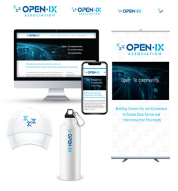
In the example below, you will see that the logo is simplified as it is reduced, yet as a designer, I now have options in what I would like to use when designing the different touchpoints for that brand. Maybe I will use the logo in full on a tradeshow booth, but use just the mark as an emblem on a baseball cap or as the full logo on the mobile view of the site or mobile app icon.
So, is your logo responsive?
Does your branding have options yet still stray true to your company mark? Give me a shout if you would like to learn more.

Do You Need a Great Design Partner?
Whether your company’s creative team is 20 people deep or you’ve been relying on some do-it-yourself design tips and tricks, you need a designer that you trust and who knows your brand inside and out to quickly catch the overflow. I call that a “design partner” and that’s what I offer you.
If you trust me to be your design partner, I will:
Save you time. Because I’d know you, your company and your brand, there will be no need to always start from scratch and bring someone new up to speed, not to mention the learning curve.
Save you money. It’s very expensive to reinvent the wheel every time you hire a new designer. A trusted partner will be on track to meet timeframes and budgets that you have agreed upon.
Will ask the right questions. I will know how to anticipate your needs and take them over so you don’t have to worry about the small stuff..
Won’t need to be micro-managed. Because we have completed successful projects previously and I have embedded myself into your team, I will know what is expected, what is the end goal, and what the outcome should be..
Be dependable and resourceful. Your calls will be answered, your requests will be fulfilled, and if something unexpectedly pops-up, I will figure it out and get it taken care of..
Ultimately provide value. As a trusted designer, I know how to make things happen. I will learn what you like and what your business needs to do, so it will be easy to just hands things off and know it will get done — and done right..
Are you looking to find a trusted resource for your brand challenges? Maybe we should talk…send me a message and we’ll set up a time to chat.