Creating Powerful Presentations
At the recent HOW Design Live Conference, held in Chicago, I had the opportunity to attend a talk by Stefan Mumaw on “Presentations That Rock: How To Stand Up There And Slay.” I was in awe of the way Mr. Mumaw described the formula for building a presentation from planning, connection, and visual support through storytelling. He brought up some compelling points of what makes a presentation successful. It suddenly struck me was that I was looking at presentations the wrong way and here is why:
There are two different types of presentations.
- Presentation with speakers who tell stories, captivating audiences with their ideas and passion. The eyes of the audience are glued to the speaker, fascinated with every word. Think great speakers like Steve Jobs, Martin Luther King, Jr, or Sheryl Sandberg. These speakers either don’t use a deck or the deck is constructed with beautiful visuals that are crafted and lovely to look at.
- Presentations that are actually documents, may be a bit more educational and serve a particular purpose for that company or event. The focus is on the content of the deck, and the speaker is less of a focal point. The decks may have a lot of bullets, charts, and graphs that may be hard to read or flash by too quickly. Now, I am not saying that this type couldn’t be captivating or tell a story, but they are handled in different ways. Therefore, the deck needs to be designed differently. In either case, the goal is to communicate an idea or that one single thing, that matters most, to the listener.
So how do I encourage my clients to think more strategically about their PowerPoint or Keynote presentations? I decided to reach out to Mr. Mumaw for his advice.
His response was this: “When starting off, ask if it is a presentation, or is it a document?”
A presentation is more than just someone talking on a stage. It is an opportunity for a speaker to become a storyteller. An excellent presentation has ebb and flow, the element of surprise, passion, the give, and take. Speakers capture the audience with authenticity, passion, emotion, and courage. If a deck is used, it is used as support, not as the guide. Decks don’t move people, people move people. The audience is solely focused on the speaker, and the deck lends itself to support the speakers’ story visually. What is the designer’s role in a presentation? To create the ebb and flow with the use of video and visual backgrounds to support but not take away from the speaker. How do I encourage my clients to rethink their presentations? Mr. Mumaw states, “It is our responsibility as a creative to teach what a presentation is before we even start a design. Come to an agreement or understanding of what makes a great presentation, that people don’t want to read, they want to be moved, and remind the client of what moves them.”

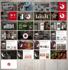
Example of a presentation that might be considered a document but utilizes a visual base.
So how do I approach this thinking with my clients? He continues, “Education is always the most effective way to collaborate, and that’s what a deck design is: a collaboration. As a designer, if you try to educate during the gathering of content, you will always lose those battles, for your client is invested in the content at the point and won’t want to waste time or circle back. But if you educate ahead of time, do your own ‘presentation on presentation,’ show decks that you believe are designed well and presentations that you believe are effective, get everyone to agree, you have a base of standard, and the subjectivity is lessened.” For this type of presentation, ideally, the designer is brought in before any type of deck is constructed so that roles, decisions, and the outcomes are agreed upon in the beginning, not during or when it is too late.
What if it is a document? In reality, most clients ask for a “document.” A team of people work on the gathering of content and data to compile into a deck, then hands it over to a designer to make pretty, seem less crowded, maybe add a few animations, etc. At this point, a “document” is comprised of a deck and a speaker (or many speakers) presenting as the voice over to that content. In this context, the audience is most likely to be less focused on the speaker and pay more attention to the deck.
As a designer, it is my task to take that information then and apply a design that helps assist with that story. How do I design the ebb and flow, add surprises and resolution in the content provided to me and make it visually interesting? That is the challenge. Mr. Mumaw recommends asking these essential questions:
- What is the purpose?
- Who will need to edit?
- How will it be delivered?
- Who is the audience?
- What is the lifespan?
Once you have these answers, as a designer, you should be able to know your limits and set out to design, and design it well.
When thinking about what type of presentation you want to create, know your audience well! “Every industry is different. Every audience in every industry has one thing in common: they’re human. They can, and want to be moved. What moves a group of scientists is different than what moves a group of film students, but both want to be inspired, they want to be informed, and they want to be entertained.”
I was very honored to have Mr. Mumaw’s advice. I genuinely appreciate his viewpoint and hope you do, too. And to quote his sincere sign-off: “No one has ever said, ‘Man, I hope this presentation is information dense, and the presenter reads it.’ At least I haven’t come across someone who has yet”!
So when all is said in done, I hope to be able to incorporate his guidance into my next presentation assignment – maybe for you? If you’re starting to think about your upcoming presentation (or a future project) and want to create a “presentation that rocks,” let’s talk.
BRAND ESSENTIALS FOR THE ENTREPRENEUR
Read more about branding, strategy, and visual communications.
JFG VISUAL COMMUNICATIONS
Are you ready to elevate your business to the next level?
Regardless if you’re in the starting phase of your business or in the position to take your startup to the next level, you don’t have to do it alone. Learn more by scheduling a complimentary 30-minute consultation and let's get started today!


